
- Like
- SHARE
- Digg
- Del
- Tumblr
- VKontakte
- Flattr
- Buffer
- Love This
- Save
- Odnoklassniki
- Meneame
- Blogger
- Amazon
- Yahoo Mail
- Gmail
- AOL
- Newsvine
- HackerNews
- Evernote
- MySpace
- Mail.ru
- Viadeo
- Line
- Comments
- Yummly
- SMS
- Viber
- Telegram
- JOIN
- Skype
- Facebook Messenger
- Kakao
- LiveJournal
- Yammer
- Edgar
- Fintel
- Mix
- Instapaper
- Copy Link
When you’re sifting through your News Feed, what tends to catch your attention? More likely than not, it’s YouTube videos, pictures, animated GIFs, and other visual content, right?
While text-based content is always important when seeking answers to a question, creating visuals such as infographics, charts, graphs, animated GIFs, and other shareable images can do wonders for catching your readers’ attention and enhancing your article or report.
I know what you might be thinking: “I don’t know how to design awesome visuals. I’m not creative.”
Hi. I’m Bethany, and I will be the first to tell you that I’m not naturally artistic. And yet, I found a strength in data visualization at HubSpot, where I’ve spent most of my days creating infographics and other visuals for blog posts.
So, while I wouldn’t say I’m naturally artistic, I have learned how to create compelling visual content. So can you.

And you can do this by learning color theory. Consider this your introductory course, and we’ll be covering the following topics:
- What Is Color Theory?
- Why Is Color Theory Important in Web Design?
- Color Theory 101
- Additive & Subtractive Color Theory
- How to Choose a Color Scheme
- Color Tools
What Is Color Theory?
Color theory is the basis for the primary rules and guidelines that surround color and its use in creating aesthetically pleasing visuals. By understanding color theory basics, you can begin to parse the logical structure of color for yourself to create and use color palettes more strategically. The result means evoking a particular emotion, vibe, or aesthetic.
Why Is Color Theory Important in Web Design?
Color is an important aspect, if not the most important aspect of design, and can influence the meaning of text, how users move around a particular layout, and what they feel as they do so. By understanding color theory, you can be more intentional in creating visuals that make an impact.
While there are many tools out there to help even the most inartistic of us to create compelling visuals, graphic design tasks require a little more background knowledge on design principles.
Take picking the right colors, for instance. It’s something that might seem easy at first, but when you’re staring down a color wheel, you’re going to wish you had some information on what you’re looking at.
Read on to learn about the terms, tools, and tips you should know to pick the best colors for your designs.
Color Theory 101
Let’s first go back to high school art class to discuss the basics of color.
Remember hearing about primary, secondary, and tertiary colors? They’re pretty important if you want to understand, well, everything else about color.
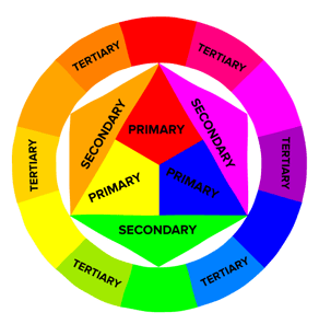
Primary Colors
Primary colors are those you can’t create by combining two or more other colors together. They’re a lot like prime numbers, which can’t be created by multiplying two other numbers together.
There are three primary colors:
- Red
- Yellow
- Blue
Think of primary colors as your parent colors, anchoring your design in a general color scheme. Any one or combination of these colors can give your brand guardrails when you move to explore other shades, tones, and tints (we’ll talk about those in just a minute).
When designing or even painting with primary colors, don’t feel restricted to just the three primary colors listed above. Orange isn’t a primary color, for example, but brands can certainly use orange as their dominant color (as we at HubSpot know this quite well).
Knowing which primary colors create orange is your ticket to identifying colors that might go well with orange — given the right shade, tone, or tint. This brings us to our next type of color …
Secondary Colors
Secondary colors are the colors that are formed by combining any two of the three primary colors listed above. Check out the color theory model above — see how each secondary color is supported by two of the three primary colors?
There are three secondary colors: orange, purple, and green. You can create each one using two of the three primary colors. Here are the general rules of secondary color creation:
- Red + Yellow = Orange
- Blue + Red = Purple
- Yellow + Blue = Green
Keep in mind that the color mixtures above only work if you use the purest form of each primary color. This pure form is known as a color’s hue, and you’ll see how these hues compare to the variants underneath each color in the color wheel below.
Tertiary Colors
Tertiary colors are created when you mix a primary color with secondary color.
From here, color gets a little more complicated. And if you want to learn how the experts choose color in their design, you’ve got to first understand all the other components of color.
The most important component of tertiary colors is that not every primary color can match with a secondary color to create a tertiary color. For example, red can’t mix in harmony with green, and blue can’t mix in harmony with orange — both mixtures would result in a slightly brown color (unless of course that’s what you’re looking for).
Instead, tertiary colors are created when a primary color mixes with a secondary color that comes next to it on the color wheel below. There are six tertiary colors that fit this requirement:
- Red + Purple = Red-Purple (magenta)
- Red + Orange = Red-Orange (vermillion)
- Blue + Purple = Blue-Purple (violet)
- Blue + Green = Blue-Green (teal)
- Yellow + Orange = Yellow-Orange (amber)
- Yellow + Green = Yellow-Green (chartreuse)
The Color Theory Wheel
Okay, great. So now you know what the “main” colors are, but you and I both know that choosing color combinations, especially on a computer, involves a much wider range than 12 basic colors.
This is the impetus behind the color wheel, a circle graph that charts each primary, secondary, and tertiary color — as well as their respective hues, tints, tones, and shades. Visualizing colors in this way helps you choose color schemes by showing you how each color relates to the color that comes next to it on a rainbow color scale. (As you probably know, the colors of a rainbow, in order, are red, orange, yellow, green, blue, indigo, and violet.)

When choosing colors for a color scheme, the color wheel gives you opportunities to create brighter, lighter, softer, and darker colors by mixing white, black, and gray with the original colors. These mixes create the color variants described below:
Hue
Hue is pretty much synonymous to what we actually mean when we said the word “color.” All of the primary and secondary colors, for instance, are “hues.”
Hues are important to remember when combining two primary colors to create a secondary color. If you don’t use the hues of the two primary colors you’re mixing together, you won’t generate the hue of the secondary color. This is because a hue has the fewest other colors inside it. By mixing two primary colors that carry other tints, tones, and shades inside them, you’re technically adding more than two colors to the mixture — making your final color dependent on the compatibility of more than two colors.
If you were to mix the hues of red and blue together, for instance, you’d get purple, right? But mix a tint of red with the hue of blue, and you’ll get a slightly tinted purple in return.
Shade
You may recognize the term “shade” because it’s used quite often to refer to light and dark versions of the same hue. But actually, a shade is technically the color that you get when you add black to any given hue. The various “shades” just refer to how much black you’re adding.
Tint
A tint is the opposite of a shade, but people don’t often distinguish between a color’s shade and a color’s tint. You get a different tint when you add white to a color. So, a color can have a range of both shades and tints.
Tone (or Saturation)
You can also add both white and black to a color to create a tone. Tone and saturation essentially mean the same thing, but most people will use saturation if they’re talking about colors being created for digital images. Tone will be used more often for painting.
Additive & Subtractive Color Theory
If you’ve ever played around with color on any computer program, you’ve probably seen a module that listed RGB or CMYK colors with some numbers next to the letters.
Ever wondered what those letters mean?
CMYK
CMYK stands for Cyan, Magenta, Yellow, Key (Black). Those also happen to be the colors listed on your ink cartridges for your printer. That’s no coincidence.
CMYK is the subtractive color model. It’s called that because you have to subtract colors to get to white. That means the opposite is true — the more colors you add, the closer you get to black. Confusing, right?

Think about printing a piece of paper. When you first put a sheet in the printer, you’re typically printing on a white piece of paper. By adding color, you’re blocking the white wavelengths from getting through.
Then, let’s say you were to put that printed piece of paper back in the printer, and print something on it again. You’ll notice the areas that have been printed on twice tend to colors closer to black.
I find it easier to think about CMYK in terms of its corresponding numbers. CMYK works on a scale of 0 to 100. If C=100, M=100, Y=100, and K=100, you end up with a black color. But, if all four colors equal 0, you end up with true white.
RGB
RGB color models, on the other hand, are designed for electronic displays, including computers.
RGB stands for Red, Green, Blue, and is based on the additive color model of light waves. This means, the more color you add, the closer you get towards white. For computers, RGB is created using scales from 0 to 255. So, black would be R=0, G=0, and B=0. White would be R=255, G=255, and B=255.

When you’re creating color on a computer, your color module will usually list both RGB and CMYK numbers. In practice you can use either one to find colors, and the other color model will adjust accordingly.
However, many web programs will only give you the RGB values or a HEX code (the code assigned to color for CSS and HTML). So, if you’re designing digital images or for web design, RGB is probably your best bet for choosing colors.
You can always convert the design to CMYK and make adjustments should you ever need it for printed materials.
How to Choose a Color Scheme
- Consider your color context.
- Refer to a color wheel to identify analogous colors.
- Refer to a color wheel to identify complementary colors.
- Focus on monochromatic colors in the same hue.
- Use a triadic color scheme to create high contrast.
- Create a split complementary color scheme.
- Think beyond the presets, but start with just one color.
Now that we’ve got all of the basics of color theory down, let’s talk about how to actually use this newfound knowledge to form designs that perfect your brand and resonate with your audience.
You’ve probably noticed before that some colors look great together and others, well, just don’t. The colors we choose can help enhance a design, or it can take away from a design.
When you’re figuring out how to design a graphic, it’s important to remember that how we perceive colors depends on the context in which we see it.
1. Consider your color context.
Color context refers to how we perceive colors as they contrast with another color. Look at the pairs of circles in the example below to see what I mean.
The middle of each of the circles is the same size, shape, and color. The only thing that changes is the background color. Yet, the middle circles appear softer or brighter depending on the contrasting color behind it. You may even notice movement or depth changes just based on one color change.
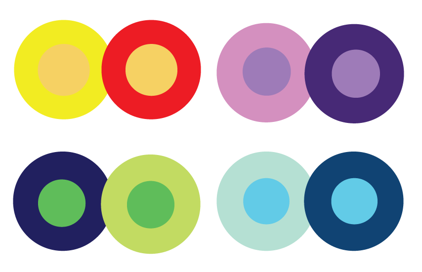
This is because the way in which we use two colors together changes how we perceive it. So, when you’re choosing colors for your graphic designs, think about how much contrast you want throughout the design.
For instance, if you were creating a simple bar chart, would you want a dark background with dark bars? Probably not. You’d most likely want to create a contrast between your bars and the background itself since you want your viewers to focus on the bars, not the background.
Choosing colors with high contrast, however, isn’t always as hard as choosing colors that look good together.
For me, this is where choosing color is trickiest. I could spend hours choosing colors for an infographic simply because it takes awhile to get a feel for what looks best together.
In reality, though, I usually don’t have hours to spend just choosing colors. (And that’d probably be a waste of time even if I did have a few hours.)
Luckily, there are logical rules for how to create color schemes that work together.
2. Refer to a color wheel to identify analogous colors.
Analogous color schemes are formed by pairing one main color with the two colors directly next to it on the color wheel. You can also add two additional colors (which are found next to the two outside colors) if you want to use a five-color scheme instead of just three colors.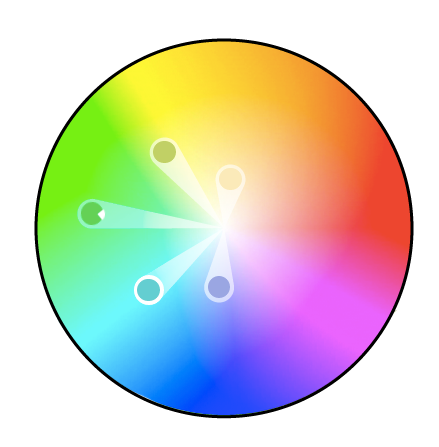
Analogous structures do not create themes with high contrasting colors, so they’re typically used to create a softer, less contrasting design. For example, you could use an analogous structure to create a color scheme with autumn or spring colors.
I like to use this color scheme to create warmer (red, oranges, and yellows) or cooler (purples, blues, and greens) color palettes like the one below. There isn’t a high contrast between these colors, but don’t they just look nice together?
I’d probably use this palette to design an image rather than an infographic or bar chart as I would want all of the elements in the image to blend together nicely.

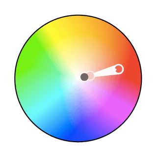
3. Refer to a color wheel to identify complementary colors.
You may have guessed it, but a complementary color scheme is based on the use of two colors directly across from each other on the color wheel and relevant tints of those colors.
The complementary color scheme provides the greatest amount of color contrast. Because of this, you should be careful about how you use the complementary colors in a scheme. 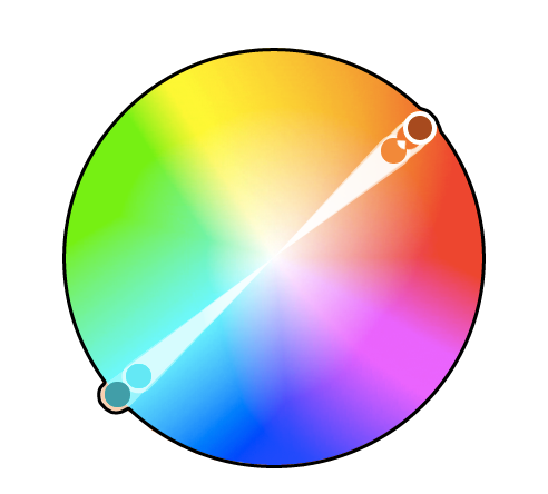 It’s best to use one color predominantly and use the second color as accents in your design.
The complementary color scheme is also great for charts and graphs. High contrast helps you highlight important points and takeaways.
However, if I were to use these colors in an infographic, I’d probably need to use a much lighter color for the actual background. Can you imagine choosing one of the oranges as a background with blues as accents and text? That’d probably be too overpowering and difficult to read.

4. Focus on monochromatic colors in the same hue.
Using a monochromatic schemes allows you create a color scheme based on various shades and tints of one hue. Although it lacks color contrast, it often ends up looking very clean and polished. It also allows you to easily change the darkness and lightness of your colors.
I like to use monochromatic color schemes for charts and graphs, but only when creating high contrast isn’t necessary. However, monochromatic schemes don’t tend to “pop,” so if you’re looking for a color scheme that’s bright and attention grabbing, this one isn’t your best bet.
Check out all the monochromatic colors that fall under the red hue, a primary color.

5. Use a triadic color scheme to create high contrast.
Triadic color schemes offer high contrasting color schemes while retaining the same tone. Triadic color schemes are created by choosing three colors that are equally placed in lines around the color wheel.
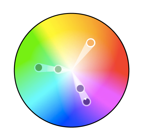
Triad color schemes are useful for creating high contrast between each color in a design, but they can also seem overpowering if all of your colors are chosen on the same point in a line around the color wheel.
To subdue some of your colors in a triadic scheme, you can choose one dominant color and use the others sparingly, or simply subdue the other two colors by choosing a softer tint.
The triadic color scheme looks great in graphics like bar or pie charts because it offers the contrast you need to create comparisons.
However, if I were using this color scheme to create an infographic, I’d be more likely to choose one color as the background color, such as the yellow or light green, and a darker contrasting color as the dominant color. I then might use the other three colors as accents throughout. By changing up the intensity of the colors in the design, I can highlight important points and takeaways.

6. Create a split complementary color scheme.
A split complementary scheme includes one dominant color and the two colors directly adjacent to the dominant color’s complement. This creates a more nuanced color palette than a complementary color scheme while still retaining the benefits of contrasting colors.

The split complementary color scheme can be difficult to balance well because unlike analogous or monochromatic color schemes, the colors used all provide contrast (similar to the complementary scheme).
I can imagine using the following split complementary color scheme in a variety of ways. I could use this in an chart or graph because it gives me the contrast I need and the colors remain visually appealing.
I could also imagine using these colors in an infographic, although I’d play around with the colors a bit more to see which pairs look best together.
The positive and negative aspect of the split complementary color model is that you can use any two colors in the scheme and get great contrast … but that also means it can also be tricky to find the right balance between the colors. As a result, you may end up playing around with this one a bit more to find the right combination of contrast.

No matter which color scheme you choose, try and keep in mind what your graphic needs. If you need to create contrast, then choose a color scheme that gives you that. On the other hand, if you just need to find the best “versions” of certain colors, then play around with the monochromatic color scheme to find the perfect shades and tints.
I’ve found that simply understanding how color schemes are built goes a long way for helping me choose the right color scheme. If I just think: “What is the goal of this graphic?” I can start to determine how much (or how little) contrast I need.
Remember, if you build a color scheme with five colors, that doesn’t mean you have to use all five. Sometimes just choosing two colors from a color scheme looks much better than cramming all five colors together in one graphic.
7. Think beyond the presets, but start with just one color.
Before I send you off to create amazing images to improve you blog and social posts, let me give you a few extra tips for choosing colors:
- Don’t stick with presets. Almost every program you use will automatically give you preset colors. Get past the presets and explore color on your own. Don’t let the program decide how you use color in your design.
- Start with one color you like. Every time I design something, I start with one color and build the color scheme from there. If you try and start with more than one color, you’ll have a harder time finding harmony between your colors.
- Save your color schemes. If you find a color (or color scheme) you like, it’ll probably be useful to you later. I wouldn’t suggest using the same color scheme for every chart or graphic you create, but you can always use different schemes in different ways later on.
- Practice makes perfect. The more you play with color and practice design, the better you get. No one creates their masterpiece the first time around.
Color Tools
There’s been a lot of theory and practical information for actually understanding which colors go best together and why. But when it comes down to the actual task of choosing colors while you’re designing, it’s always a great idea to have tools to help you actually do the work quickly and easily.
Luckily, there are a number of tools to help you find and choose colors for your designs.
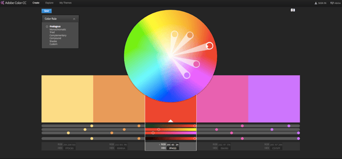
Adobe Color
One of my favorite color tools to use while I’m designing anything — whether it’s an infographic or just a pie chart — is Adobe Color (previously Adobe Kuler).
This free online tool allows you to quickly build color schemes based on the color structures that were explained earlier in this post. Once you’ve chosen the colors in the scheme you’d like, you can copy and paste the HEX or RGB codes into whatever program you’re using.
It also features hundreds of premade color schemes for you to explore and use in your own designs. If you’re an Adobe user, you can easily save your themes to your account.
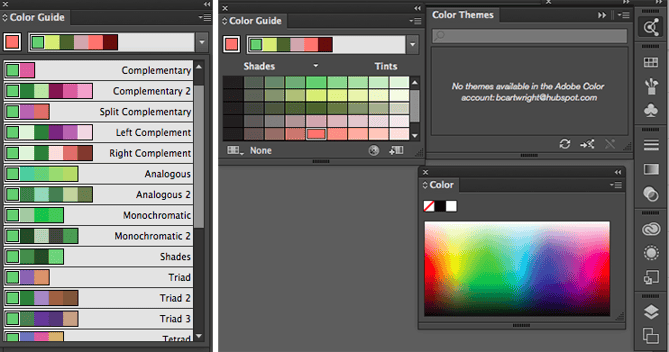
Illustrator Color Guide
I spend a lot of time in Adobe Illustrator, and one of my most-used features is the color guide. The color guide allows you to choose one color, and it will automatically generate a five-color scheme for you. It will also give you a range of tints and shades for each color in the scheme.
If you switch your main color, the color guide will switch the corresponding colors in that scheme. So if you’ve chosen a complementary color scheme with main color of blue, once you switch your main color to red, the complementary color will also switch from orange to green.
Like Adobe Color, the color guide has a number of preset modes to choose the kind of color scheme you want. This helps you pick the right color scheme style within the program you’re already using.
After you’ve created the color scheme that you want, you can save that scheme in the “Color Themes” module for you to use throughout your project or in the future.
Preset Color Guides
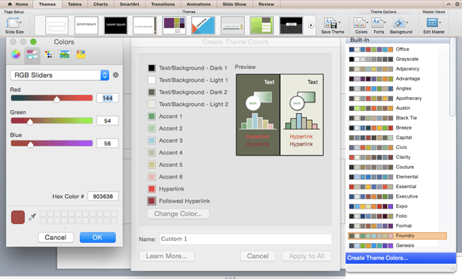
If you’re not an Adobe user, you’ve probably used Microsoft Office products at least once. All of the Office products have preset colors that you can use and play around with to create color schemes. PowerPoint also has number of color scheme presets that you can use to draw inspiration for your designs.
Where the color schemes are located in PowerPoint will depend on which version you use, but once you find the color “themes” of your document, you can open up the preferences and locate the RGB and HEX codes for the colors used.
You can then copy and paste those codes to be used in whatever program you’re using to do your design work.
There’s a lot of theory in this post, I know. But when it comes to choosing colors, understanding the theory behind color can do wonders for how you actually use color. This can make creating branded visuals easy, especially when using design templates where you can customize colors.

Editor’s note: This post was originally published in October 2018 and has been updated for comprehensiveness.
Originally published Jun 25, 2020 10:00:00 AM, updated June 25 2020