- Like
- SHARE
- Digg
- Del
- Tumblr
- VKontakte
- Flattr
- Buffer
- Love This
- Save
- Odnoklassniki
- Meneame
- Blogger
- Amazon
- Yahoo Mail
- Gmail
- AOL
- Newsvine
- HackerNews
- Evernote
- MySpace
- Mail.ru
- Viadeo
- Line
- Comments
- Yummly
- SMS
- Viber
- Telegram
- JOIN
- Skype
- Facebook Messenger
- Kakao
- LiveJournal
- Yammer
- Edgar
- Fintel
- Mix
- Instapaper
- Copy Link
In the last 12 months, 77% of marketers have seen an increase in email engagement. Cold prospects get to know and trust you, while you stay top of mind (or top of inbox). However, your team needs to drive signups to reap the benefits.

![→ Download Now: The Beginner's Guide to Email Marketing [Free Ebook]](https://no-cache.hubspot.com/cta/default/53/53e8428a-29a5-4225-a6ea-bca8ef991c19.png)
That all starts with your sign-up form. Better email sign-up forms can help grow your lists, increasing your brand’s engagement. See these email newsletter sign-up form examples for inspiration.
Table of Contents
What Is an Email Sign-up Form?
Ways to Increase Subscribers for Your Email List
Email Sign-up Form Best Practices
Great Email Newsletter Sign-up Form Examples
What is an email sign-up form?
An email newsletter sign-up form collects email addresses from prospects. These forms are embedded on a web page. Visitor can then enter their email address and get added to your email newsletter.
The best thing about email opt-ins is that you can build a pipeline of leads to nurture. Over time, your email list can turn into a valuable source of revenue. Here are our tips for how to get more mailing list sign-ups.
How to Increase Email Subscribers
- Monitor your metrics.
- Incorporate calls-to-action.
- Investigate pipeline gaps.
- Use contrasting colors.
- Consider placement.
- Offer value and choice.
- Reduce friction.
- Try out different phrasing.
- Consider user intent.
- Minimize the number of forms and CTAs.
- Use a form builder.
- Use pop ups.
- Test everything.
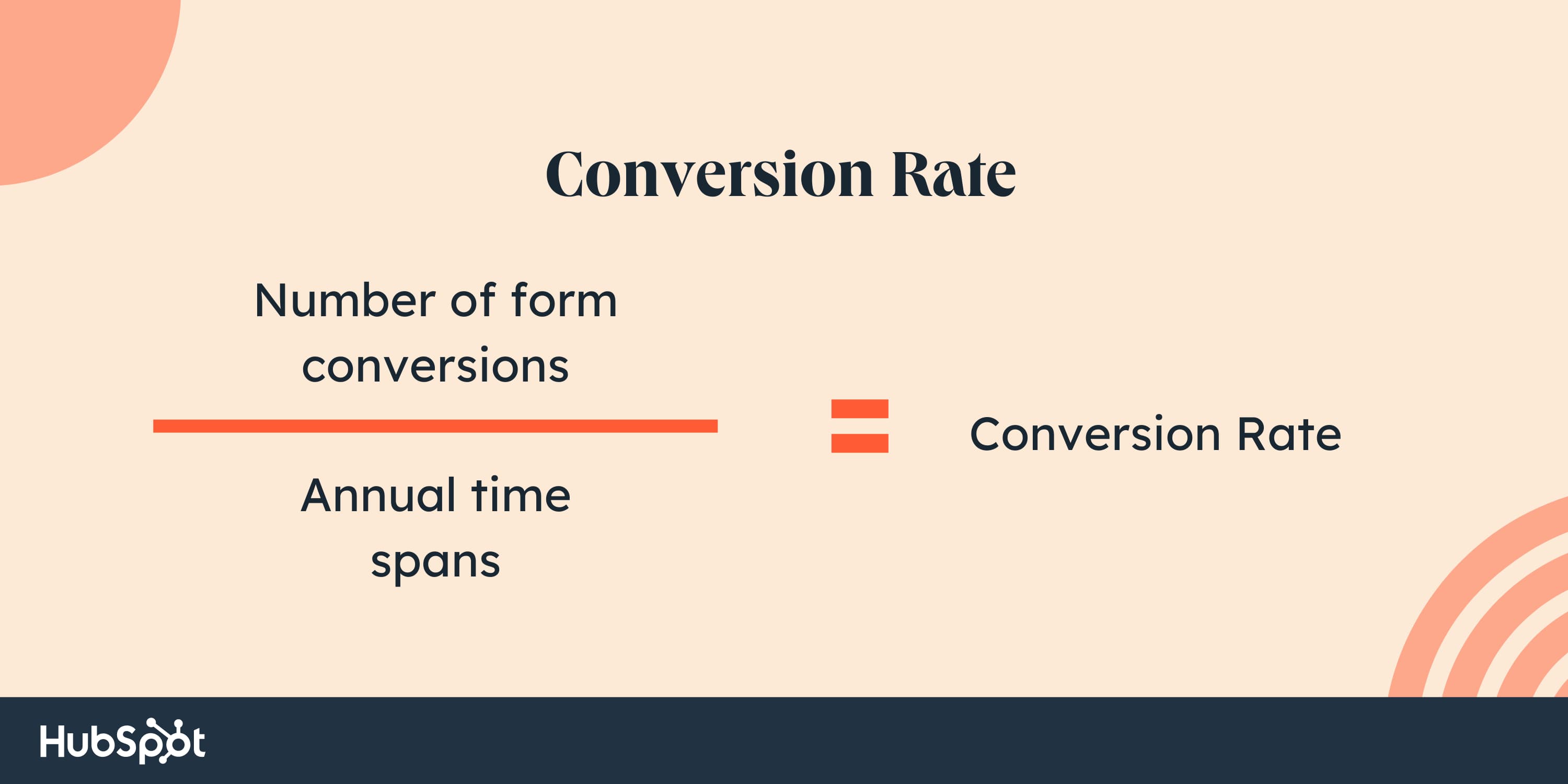
1. Monitor your metrics.
Your conversion rate refers to the percentage of website visitors who convert on your opt-in. To calculate your conversion rate, divide the number of conversions from that form or offer by the amount of traffic to the page or post it’s on.
Let’s say you have two forms for the same newsletter. One form has a 3% conversion rate. The second converts .8% of page visitors. The form with the higher conversion rate generates more leads and produces more value for the sales team.
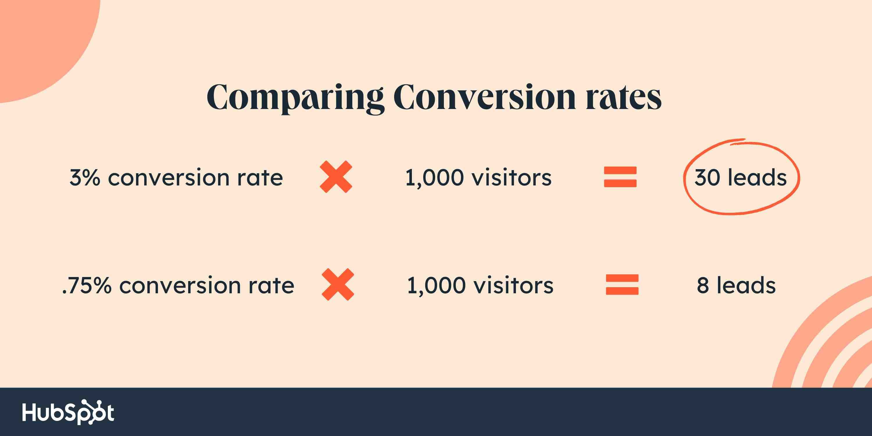
With 1000 website visitors, the first form would generate 22 more leads than the second. That’s why conversion rate optimization is so important.
2. Incorporate calls-to-action.
Conversions to your email sign-up form only happen if the form is seen. For this reason, you should be putting the opportunity in front of your website visitors.
Identify your highly visited pages and put your form or calls-to-action (CTA) on them to maximize visibility.
3. Investigate pipeline gaps.
If you don’t have a large amount of traffic, finding ways to increase it may be a more worthwhile activity. Conversions only happen when there’s an opportunity to convert. With no traffic, there’s no opportunity.
You won’t have the means to increase your conversion rate if the starting number is zero. If traffic is low, your conversion rates may not be statistically significant.
4. Use contrasting colors.
The last thing you want is for a potential subscriber to miss the opportunity to convert simply because they didn’t notice it was there. Use contrasting colors to make these conversion elements stand out.
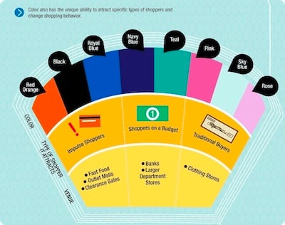
For instance, in the example below, Kiss Metrics has identified correlations between specific colors and shopper psychology. Specific hues and contrasts elicit specific responses. Using color theory can encourage prospects to act.
5. Consider placement.
Prominent page placement is a game-changer when it comes to increasing conversion rates on email sign-up forms. A form or call-to-action can go in many places, including:
- The top of the page.
- Within the text of the page.
- In the sidebar.
- At the bottom of the page.
- As a pop-up generated from a user action.
You’ll want to test which placements work for your conversion rates. For example, if people aren’t making it to the bottom of a post, they may not see your call-to-action. Through testing, you’ll be able to determine the placements that work best for your audience.
6. Offer value and choice.
Today’s internet user knows handing over their email address may result in email solicitation or, in some cases, spam. That may not be your intention, but that doesn’t erase their caution. To overcome this caution, you must incentivize them to give it up.
Promising high-value content that they want, providing social proof that your newsletter is valuable, holding giveaways or contests, and being transparent about what they can expect are all ways to provide the incentive.
Another option is to offer the user the choice of what type/category of content they’d like to receive. Nothing like autonomy to keep ’em coming back!
7. Reduce friction.
“Dollars flow where friction is low.”
— Brian Halligan, INBOUND 2019
The more friction that a visitor encounters, the less likely they’ll sign up.
One way that you can reduce friction is by removing form fields to make the process of signing up faster. The number of required form fields should be proportional to the amount of value you’re providing. Too many fields will cause the user to bounce. Instead, ask for less up front and have your team gather additional information after the individual has become a lead.
8. Try out different phrasing.
Don’t be afraid to scrap phrasing that is underperforming. Maybe the word “newsletter” fails to appeal to your specific audience. Switch it out with something different and monitor your metrics to see what happens.
9. Consider user intent.
Your website visitors landed on your page for a reason. If your offer doesn’t help them meet that need, they won’t be incentivized to convert.
For example, let’s say you have a blog post that compares your product or service to a competitor’s. The visitor arrived here because they want to see how well you match up with others in the industry.
If your on-page offer is an ebook with “Reasons Why You Should Buy [Product/Service],” you may fall flat. If the user is already comparing providers, they already know the value of the product or service. They’re just figuring out which provider to go with.
In this scenario, an offer suited to this intent, like a product demo, will work much better.
Consider the intent on your pages and craft offers that match up with that intent.
10. Minimize the number of forms and CTAs.
As the old saying goes, “A confused mind says no.” If you present website visitors with too many choices, you run the risk of driving them away completely.
Consider presenting one offer or conversion element per page. If that’s not possible, find other ways to reduce the confusion and make it clear exactly what you want the website visitor to do.
11. Use a form builder.
Some form builders (like HubSpot’s) can remove form fields if the CRM already knows the information. This clears the friction of the user typing that information again. Creating an easy user experience will increase your conversion.
12. Use pop-ups.
Pop-ups may seem intrusive. However, when used correctly, they convert! By using a pop-up tool, offering something of value, and using specific triggers (such as exit intent), you can create a pop-up experience that isn’t annoying and generates leads.
13. Test everything.
Testing has been mentioned already in a few of the tips above, but it stands to get its own section. Improvement doesn’t happen in a vacuum. By testing hypotheses and continuing to iterate improvements, you’ll learn about your audience and increase email sign-ups as a result.
A lead might provide their email address for any number of reasons — to receive details about sales, blog post notifications, a discount code, or information about your business. In any case, that makes your email sign-up form one of the most important things on your site.
Let’s go over some ways to create a sign-up form that will get more leads on your email list.
Best Practices
- Clear Value Exchange
- Double Opt-In
- Simplicity
- Place and Time
- Kickback Emails
Whether you’re looking to reach ten people or ten million, you’ll need to create a sign-up form that gets people excited to sign up. Here are some best practices that will help you create a high-converting email sign-up form.
1. Clear Value Exchange
An email address is a valuable commodity. Your offering should be worth their while. Add a short description to the top of your email sign-up form that describes what your lead will get in return for signing up and make it good.
For example, instead of saying ”Sign up for our weekly newsletter” you should say, “Sign up for our newsletter to receive exclusive deals.” A strong incentive means your website visitors are more likely to convert.
Pro tip: Your leads should be able to answer the question, “What’s in it for me?” when they complete your form.
2. Double Opt-In
You don’t necessarily need more sign-ups. You need quality sign-ups. These quality sign-ups mean fewer fake leads wasting your time. Plus, there are fewer chances that you’ll end up in SPAM.
To ensure quality sign-ups on your form, consider using a double opt-in. This is the type of email subscription that confirms your lead wants to be added to your email list twice. The first time is when the lead enters and submits their information using your web form, and the second requires the lead to click an additional CTA (usually in their inbox) that confirms their submission.
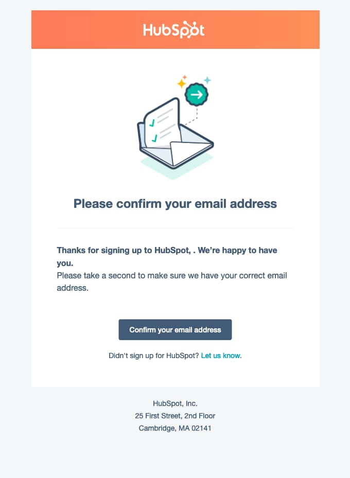
A double confirmation means a high-quality relationship with your leads.
3. Simplicity
Successful email sign-up forms are straightforward and clear. A lead should be able to look at the form, enter their information, hit “submit”, and carry on with their lives within a matter of seconds. If your form is too complex, you risk losing the interest of your website visitors.
Remember: Your email sign-up form is just a way for visitors to sign up for emails. Your team can build from there.
4. Place and Time
The placement of your email sign-up form on your website matters. Think about how you want your website visitors to find your form. Do you want your form to pop up on the page the second someone lands on your website? Do you want them to scroll down to the bottom of your homepage to find your form? Or do they need to land on a specific page on your site?
Form placement isn’t one-size-fits-all. Think about where most visitors land on your site, how your buyer personas want to interact with your brand, and the overall user experience.
Consider questions like, “Will my target audience get frustrated with a pop-up the second they enter our site, or will they find it helpful?”
5. Kickback Emails
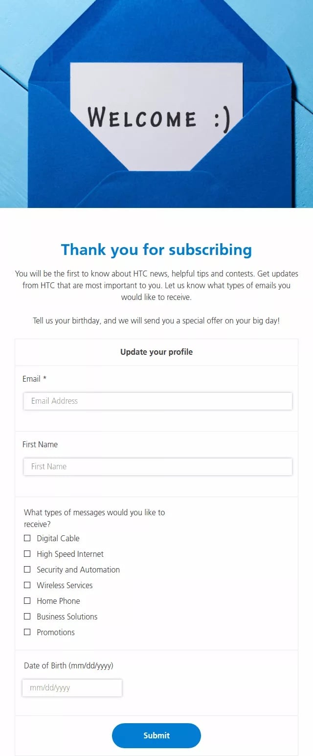
Once someone completes your form, thank and welcome them.
A kickback email gives your new lead something in return for their information. In the case of an email sign-up, you’ll want to welcome your new lead and perhaps offer them links to useful content. Get them excited about their decision to give you their personal information.
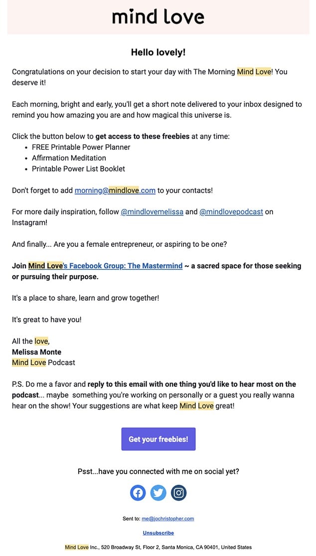
This is also where you can provide your new leads with their discount codes, details on future sales, access to exclusive communities, why you value their interest in your business, and how you will support them in the future.
Now that we’ve reviewed email sign-up form best practices, let’s dive into some examples. Here’s a collection of our favorite email newsletter forms and CTAs.
Email Sign-up Form Examples
- The Hustle
- Blavity
- Anthropologie
- Lulus
- Quest Nutrition
1. The Hustle
The Hustle website has an email sign-up form with a clear benefit statement. Any website visitor could look at this subscription landing page and understand what they will get from signing up in a matter of seconds.
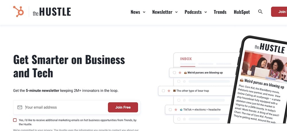
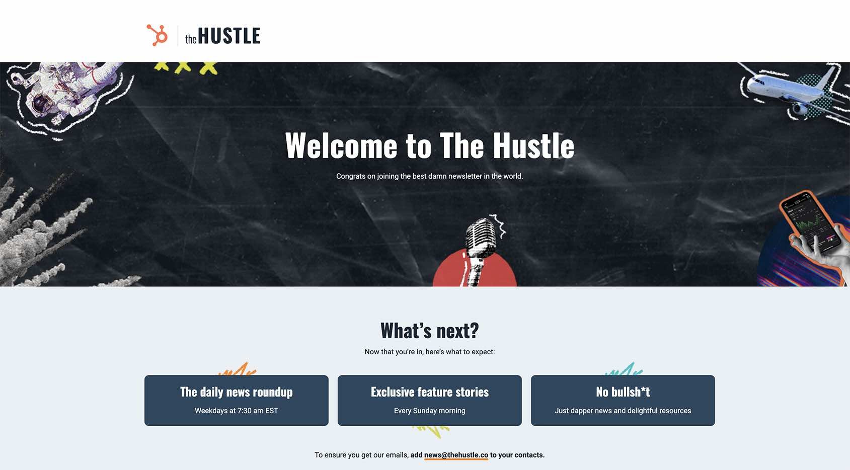
They also utilize the “Thank You” page to convey a direct statement of how the company values the subscriber’s time and will intentionally curate scheduled-themed content.
2. Blavity
When you head to Blavity’s website, the first thing you see is their email pop-up. That’s because their entire business revolves around a subscription. Blavity is an online publication that gathers top news stories from around the globe. The placement of their sign-up form fits with its offering.

Blavity also has a landing page specifically devoted to email sign-up.

3. Anthropologie
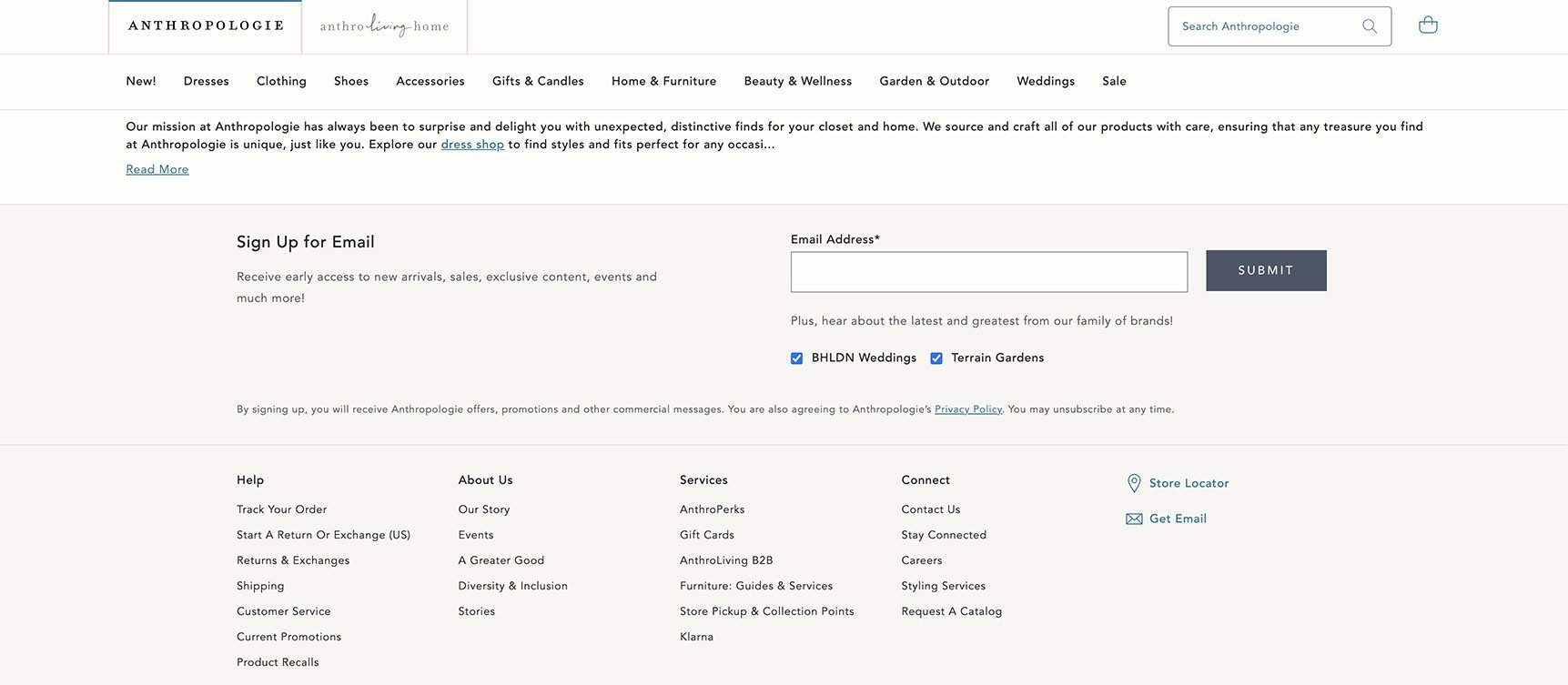
Anthropologie places their email sign-up form towards the bottom of their homepage after users have had a chance to look around and become familiar with the site. Their sign-up form has a short description of what leads can expect once they sign up. Anthropologie also respects their visitors’ time by simply asking for an email address.
4. Lulus
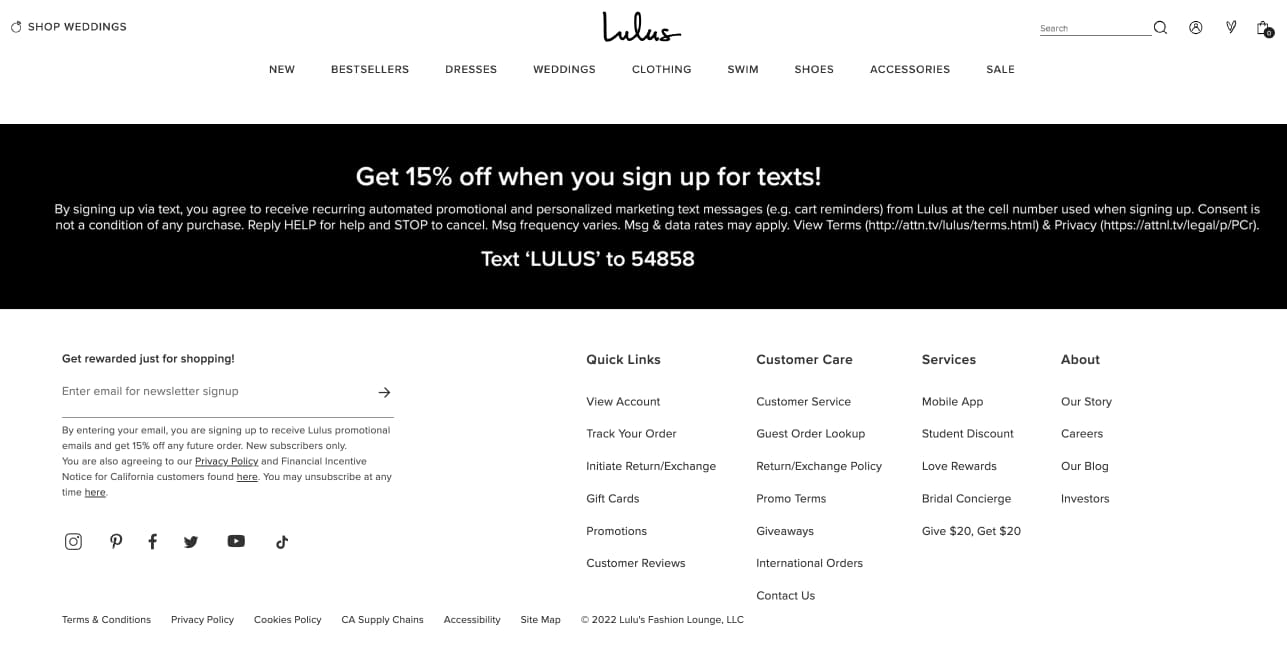
Lulus form is located towards the bottom of their homepage. Their email sign-up form gets website visitors excited about converting with an offer: a 10% discount code upon signing up.
The form is simple and only requires an email address. After form submission, new leads receive a kickback email that welcomes them and provides them with the code, as promised.
5. Quest Nutrition
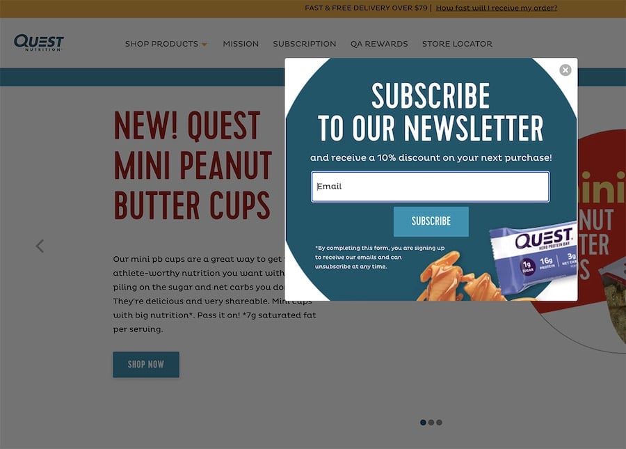
Quest Nutrition’s form is in a pop-up window that dims the background, eliminating any distractions. The form offers incentives like recipes, discounts, and surprises for visitors to sign up. Only an email address is required. Website visitors also have the option to bypass the pop-up and look around the site instead.
Email sign-up forms are a simple, efficient, and effective way to obtain leads, create more conversions, and increase your overall sales. You’ll reach your audience with email sign-up forms that are straightforward and embedded in a convenient location on your website.
So, take a few minutes to create your own email sign-up form and get started broadening your customer base, developing relationships with your potential customers, and increasing your number of leads today. From there, you can close the gap between lead and customer through email marketing.
Editor’s note: This post was originally published in October 2018 and has been updated for comprehensiveness.